Session 02
Pandas - python data analysis tool
Brief introduction into Pandas
Pandas is a software library written for the Python programming language for data manipulation and analysis. In particular, it offers data structures and operations for manipulating numerical tables.
In comparison with Microsoft Excel, Pandas has no real limit and handles millions of data points. It is easier to create and use complex equations and calculations on your data. As opposed to Excel, it is completely free to download and use.
Pandas and Matplotlib installation
At first, we should install Pandas and Matplotlib libraries directly to our Python IDE.
Open PyCharm, go to Settings --> Project(name_of_your_project) --> Project Interpreter.
There you can add the required packages by pressing + symbol and
install matplotlib and pandas from the available packages respectively.
Sometimes there is a problem with the installation of those packages when you have Python version 3.8. This version is relatively new, there might be incompatibilities with installing particular packages.
We can avoid such an issue. During the installation of the required packages,
install matplotlib first and then pandas, in a consecutive way.
Do not forget to update your pip as well. You can either do it in the Project Interpreter menu
or by typing python -m pip install --upgrade pip in the terminal.
If these methods are unsuccessful for you, then you should install Python version 3.7 instead of Python 3.8.
First example: IMU data
All .csv files for this course can be found under GIT FH Aachen. Log in with your FH credentials and search for it1-unterlagen, go to folder Praktikum 2. Open the intro to pandas folder and download the .csv files. Move them directly to that folder where you created your python file.
First example is about data from the two different IMUs (inertial measurement unit), ID IMU and MT IMU respectively. In the scope of tutorial, we will learn how to read a simple .csv file and plot the data.
We will start with the data. The files are called ID_IMU.csv and MT_IMU.csv. Our data is in .csv (comma-separated values) format. It is a quite popular format and actually quite simple.
Here will be shwon how to work with the ID_IMU.csv file. You can work with the file MT_IMU.csv in parallel. The steps will be very similar.
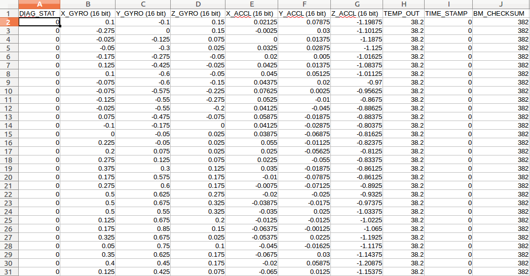
This is what the data looks like in any editor:
Open up your PyCharm. First, we have to import pandas, which is the main library:
#! /usr/bin/python

# import [module] as [another_name]
import pandas as pd
We import matplotlib for graphing:
import matplotlib.pyplot as plt
We should get our data loaded in. We do it using read_csv() function:
dataframe = pd.read_csv("ID_IMU.csv")
# in case of MT_IMU:
#dataframe = pd.read_csv("MT_IMU.csv", sep=";")
print(dataframe)
We can see all data in Run Window now.
If you do not want to load in all of the data, use head() or tail() functions to print certain number of rows from bottom or top:
print (dataframe.head(5))
We can see now only first top three rows in Run Window.
Pandas figures out that the first line of the file is the header. We can see we have a header at the top, that gives us the ten columns we have: DIAG_STAT, X_GYRO (16 bit), etc.
       DIAG_STAT  X_GYRO (16 bit)  ...  TIME_STAMP  BM_CHECKSUM
0          0            0.100  ...           0          382
1          0           -0.275  ...           0          382
2          0           -0.025  ...           0          382
3          0           -0.050  ...           0          382
4          0           -0.175  ...           0          382

[5 rows x 10 columns]
What if your .csv file does not have a header? We can still read the file, however Pandas will manually provide the header.
There is another file called ID_IMU_no_headers.csv. It is the same file as before, without the headers.
We can see data in Run Window now. 0, 0.1, -0.1, etc. are headers of columns now:
   0    0.1   -0.1   0.15  0.02125  0.07875  -1.19875  38.2      0  382
0  0 -0.275  0.000  0.150  -0.0025  0.03000  -1.10125  38.2      0  382
1  0 -0.025 -0.125  0.075   0.0000  0.01375  -1.18750  38.2      0  382
2  0 -0.050 -0.300  0.025   0.0325  0.02875  -1.12500  38.2      0  382
3  0 -0.175 -0.275 -0.050   0.0200  0.00500  -1.01625  38.2      0  382
4  0  0.125 -0.425 -0.025   0.0425  0.01375  -1.08375  38.2      0  382
But this looks not good. Let us declare our own headers. We would like to name them diagonal, x-axis, y-axis, etc:
headers = ["diagonal","x-gyros","y-gyros","z-gyros","x-accel","y-accel","z_accel","temp_out","time_stamp","checksum"]
dataframe_no = pd.read_csv("ID_IMU_no_headers.csv", names = headers)
print(dataframe_no.head(5))
We can see this result:
   diagonal  x-gyros  y-gyros  z-gyros  ...  z_accel  temp_out  time_stamp  checksum
0         0    0.100   -0.100    0.150  ... -1.19875      38.2           0       382
1         0   -0.275    0.000    0.150  ... -1.10125      38.2           0       382
2         0   -0.025   -0.125    0.075  ... -1.18750      38.2           0       382
3         0   -0.050   -0.300    0.025  ... -1.12500      38.2           0       382
4         0   -0.175   -0.275   -0.050  ... -1.01625      38.2           0       382

[5 rows x 10 columns]
As we have data now, it is time to plot it.
We start by removing the index from the file, as Pandas by default puts an index. If we see our data structure, we can observe the values going 0,1,2,3,4….
We remove these indexes column by replacing them with diagonal column.
So, how do we replace one with another?
dataframe = pd.read_csv("ID_IMU.csv")
dataframe.set_index("DIAG_STAT",inplace=True)
print(dataframe.head(5))
inplace makes the changes in the dataframe if true.
We see this result:
DIAG_STAT  X_GYRO (16 bit)  Y_GYRO (16 bit)  ...  TIME_STAMP  BM_CHECKSUM
                                ...
0                    0.100           -0.100  ...           0          382
0                   -0.275            0.000  ...           0          382
0                   -0.025           -0.125  ...           0          382
0                   -0.050           -0.300  ...           0          382
0                   -0.175           -0.275  ...           0          382

[5 rows x 9 columns]
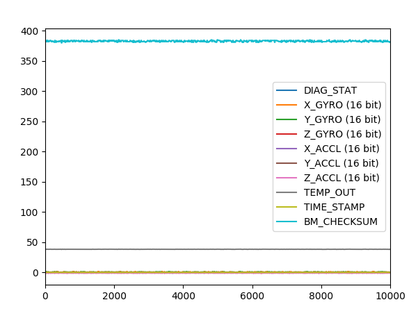
Before plotting the graph, be sure that you commented (#dataframe.set_index…) the dataframe, where you have made changes with index. Plotting with changes in index might lead to wrong graph:
dataframe.plot()
plt.show()
We get this image:
Second example: Wage hours
Let us look one more example. This time we will deal with wages data and learn how to add our own headers, deal with tab separated files and extract columns from the data.
We start as before:
#! /usr/bin/python

import pandas as pd
import matplotlib.pyplot as plt
dataframe = pd.read_csv("wages_hours.csv")
print(dataframe.head(5))
It seems to be a bit messy:
HRS\tRATE\tERSP\tERNO\tNEIN\tASSET\tAGE\tDEP\tRACE\tSCHOOL
0  2157\t2.905\t1121\t291\t380\t7250\t38.5\t2.340...
1  2174\t2.970\t1128\t301\t398\t7744\t39.3\t2.335...
2  2062\t2.350\t1214\t326\t185\t3068\t40.1\t2.851...
3  2111\t2.511\t1203\t49\t117\t1632\t22.4\t1.159\...
4  2134\t2.791\t1013\t594\t730\t12710\t57.7\t1.22...
If we open wages_hours.csv, we can notice that values in data are separated not with comma (,). Even though the name is comma separated values - csv, they can be separated by anything, including tabs.
The \t in the run window means tab. Pandas was not able to parse the file,
as it was expecting commas, not tabs. By default, it expects commas.
We will read now the file again. This time we tell to Pandas the separator
is tabs, not commas using sep = \t argument:
dataframe = pd.read_csv("wages_hours.csv", sep = "\t")
print (dataframe.head(5))
We can see organized data now:
    HRS   RATE  ERSP ERNO  NEIN  ASSET   AGE    DEP  RACE  SCHOOL
0  2157  2.905  1121  291   380   7250  38.5  2.340  32.1    10.5
1  2174  2.970  1128  301   398   7744  39.3  2.335  31.2    10.5
2  2062  2.350  1214  326   185   3068  40.1  2.851     *     8.9
3  2111  2.511  1203   49   117   1632  22.4  1.159  27.5    11.5
4  2134  2.791  1013  594   730  12710  57.7  1.229  32.5     8.8
What if there are data that more than sufficient to us. Let us extract only two columns from the dateframe, namely AGE and RATE:
dataframe2 = dataframe[["AGE","RATE"]]
print(dataframe2.head(5))
We can see data only for AGE and RATE:
    AGE   RATE
0  38.5  2.905
1  39.3  2.970
2  40.1  2.350
3  22.4  2.511
4  57.7  2.791
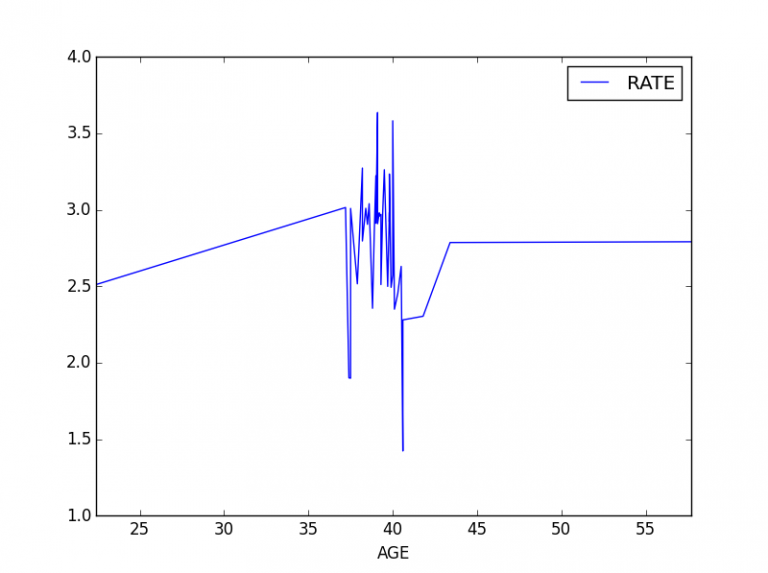
In order to plot a proper graph, we should sort the data for AGE in either ascending or descending order. Also, we should again replace AGE with index, as we did previously:
dataframe_sorted = dataframe2.sort_values(["AGE"], ascending=True)
dataframe_sorted.set_index("AGE", inplace=True)
print(dataframe_sorted.head(5))
We get:
 AGE   RATE
22.4  2.511
37.2  3.015
37.4  1.901
37.5  1.899
37.5  3.009
We are ready to plot the data:
dataframe_sorted.plot()
plt.show()
We get:
Merging in Pandas
Now, we will learn merging in Pandas.
All .csv data for this course can be found under the URL previously mentioned. Go there and select the subfolder merging in pandas now. Download the .csv files and move these files directly to that folder where you created your python file.
We will start with two files: visitors.csv and visitors-new.csv. Both files are similar. The first contains all visitors to an unknown website, second contains the new visitors only, who are visiting the website for the first time.
If you open these files, you can see that the first five lines are a comment. The actual data starts below and in the format: date, visitors. So, on 9 February, 2015, we had 59 visitors. Our first task is to remove first five lines of comments. We start by importing Python libraries:
import pandas as pd
import matplotlib.pyplot as plt
The data does not contain headers, so we have to define them on our own:
headers = ["date", "visitors"]
data = pd.read_csv("visitors.csv", skiprows=4, names = headers)
print(data.head(5))
We used the function skiprows. This means we skipped the first four rows, as they contained comments only.
You may ask why 4 rows instead of 5? Because, Pandas assumes that the 5th row is for the header. So, we get:
         date  visitors
0  2015-02-09        59
1  2015-02-08        79
2  2015-02-07        73
3  2015-02-06        89
4  2015-02-05        80
Let us now open another file, visitors-new.csv:
headers = ["date", "visitors_new"]
data_new = pd.read_csv("visitors-new.csv", skiprows=4, names = headers)
print(data_new.head(5))
We get:
         date  visitors-new
0  2015-02-09            55
1  2015-02-08            64
2  2015-02-07            61
3  2015-02-06            79
4  2015-02-05            60
We opened both files and now we can see that they contain a common field: date. The dates are actually same.
Now we will merge these two dataframes, using merge function.
Pandas is smart enough to figure out which date is common between them, so it merges on date.
You can also manually specify which field you want to merge on.
data_combined = pd.merge(data, data_new)
print(data_combined.head(5))
We now get a combined data:
         date  visitors  visitors-new
0  2015-02-09        59            55
1  2015-02-08        79            64
2  2015-02-07        73            61
3  2015-02-06        89            79
4  2015-02-05        80            60
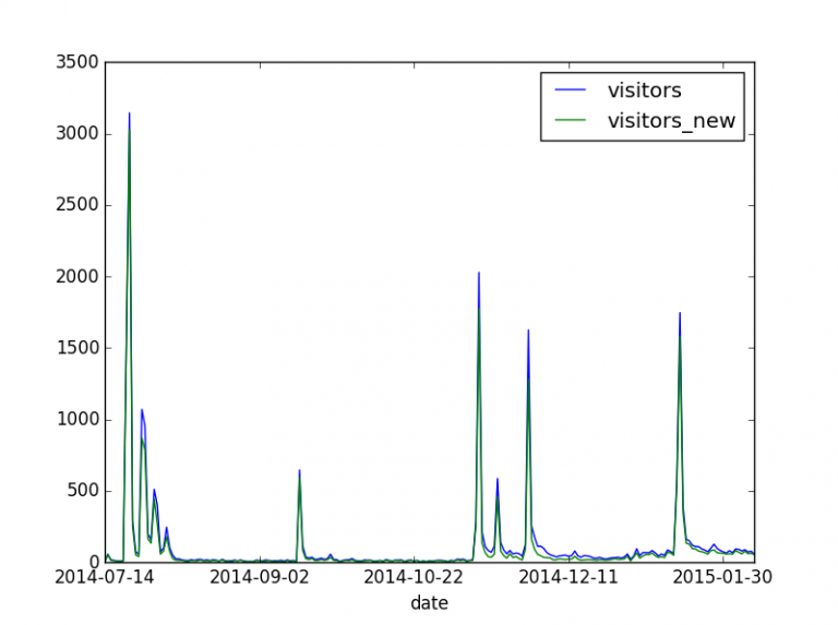
Now, let us sort the date in ascending order and remove the index:
data_combined.sort_values(["date"], inplace=True)
data_combined.set_index("date", inplace=True)
print(data_combined.head(5))
We get:
date        visitors  visitors-new
2014-07-14         5             4
2014-07-15        58            55
2014-07-16        18            15
2014-07-17        14            10
2014-07-18        11             9
We plot it:
data_combined.plot()
plt.show()
We get the following image:
Data Analysis with Pandas
We will work with obesity data in England.
The .xls file for this chapter can be found under the URL previously mentioned. Go there and select the subfolder data analysis now. Download the .xls file and move it directly to that folder where you created your python file.
We start with importing pandas and matplotlib. We should also import the xlrd dependency.
It is a utility that helps to extract data from Microsoft Excel spreadsheet files.
Go to Settings --> Project(name_of_your_project) --> Project Interpreter.
There you should add the required package by pressing + symbol and install xlrd from available packages respectively.
#! /usr/bin/python
import pandas as pd
import matplotlib.pyplot as plt
import xlrd
We will open now an .xls file. The great thing about pandas is that we can open Excel files as well. Normally, most libraries can only work with .csv files.
We print all sheet names first:
data = pd.ExcelFile("obesity-2014.xls")
print(data.sheet_names)
We get:
['Chapter 7', '7.1', '7.2', '7.3', '7.4', '7.5', '7.6', '7.7', '7.8', '7.9', '7.10']
Let us have a look at sheet 1. If you open obesity-2014.xls, sheet 7.1, you can see four columns: year, total, males, females.
The year column does not have a header. The header for year is empty. Let us define the header columns ourselves:
# Define the columns to be read
columns = ['year', 'total', 'males', 'females']
Now we read sheet 7.1. from excel file. If we look carefully, the top 4 and bottom 14 rows
contain useless info, so we should skip them, using skiprows and skipfooter functions.
The former function deals with rows in the beginning, the latter function deals with last rows. Finally, we tell pandas to name the column headers using our list of names:
data = data.parse('7.1', skiprows=4, skipfooter=14, names=columns)
print(data)
By using data.parse we are analysing a string of symbols of data structures.
We get:
       year    total   males  females
0       NaN      NaN     NaN      NaN
1   2002/03   1275.0   427.0    848.0
2   2003/04   1711.0   498.0   1213.0
3   2004/05   2035.0   589.0   1442.0
4   2005/06   2564.0   746.0   1786.0
5   2006/07   3862.0  1047.0   2807.0
6   2007/08   5018.0  1405.0   3613.0
7   2008/09   7988.0  2077.0   5910.0
8   2009/10  10571.0  2495.0   8074.0
9   2010/11  11574.0  2919.0   8654.0
10  2011/12  11736.0  2993.0   8740.0
11  2012/13  10957.0  2950.0   8007.0
If we pay attention to the result we got, we see NaN (Not A Number) values. If we compare it with the original spreadsheet, we can see that there is an empty space on line 4.
Since it is empty, it is read as NaN by pandas.
We should get rid of it. We use inbuilt dropna function.
It allows the user to analyze and drop Rows/Columns with Null values:
# Remove the N/A from the data
data.dropna(inplace = True)
We get:
       year    total   males  females
1   2002/03   1275.0   27.0    848.0
2   2003/04   1711.0   498.0   1213.0
3   2004/05   2035.0   589.0   1442.0
4   2005/06   2564.0   746.0   1786.0
5   2006/07   3862.0  1047.0   2807.0
6   2007/08   5018.0  1405.0   3613.0
7   2008/09   7988.0  2077.0   5910.0
8   2009/10  10571.0  2495.0   8074.0
9   2010/11  11574.0  2919.0   8654.0
10  2011/12  11736.0  2993.0   8740.0
11  2012/13  10957.0  2950.0   8007.0
We do not see NaN values any more.
Let us get rid of the index numbers now, as we were doing since the beginning:
data.set_index('year', inplace=True)
print(data)
We get:
   year    total   males  females
2002/03   1275.0   427.0    848.0
2003/04   1711.0   498.0   1213.0
2004/05   2035.0   589.0   1442.0
2005/06   2564.0   746.0   1786.0
2006/07   3862.0  1047.0   2807.0
2007/08   5018.0  1405.0   3613.0
2008/09   7988.0  2077.0   5910.0
2009/10  10571.0  2495.0   8074.0
2010/11  11574.0  2919.0   8654.0
2011/12  11736.0  2993.0   8740.0
2012/13  10957.0  2950.0   8007.0
Let us plot all:
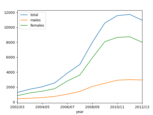
We can see that obesity for men has gone up more strongly than for women.
Let us have a look now at sheet 2. Last time we defined the headers ourselves. This time, we will let pandas pick them up:
# Read 2nd section, by age
data2  = data.parse('7.2', skiprows=4, skipfooter=14)
print(data2)
We get:
    Unnamed: 0    Total  Under 16  16-24  ...   45-54   55-64  65-74  75 and over
0         NaN      NaN       NaN    NaN  ...     NaN     NaN    NaN          NaN
1     2002/03   1275.0     400.0   65.0  ...   216.0    94.0   52.0         23.0
2     2003/04   1711.0     579.0   67.0  ...   273.0   151.0   52.0         24.0
3     2004/05   2035.0     547.0  107.0  ...   364.0   174.0   36.0         32.0
4     2005/06   2564.0     583.0   96.0  ...   554.0   258.0   72.0         20.0
5     2006/07   3862.0     656.0  184.0  ...   872.0   459.0  118.0         43.0
6     2007/08   5018.0     747.0  228.0  ...  1198.0   598.0  157.0         53.0
If you remember, the year column did not have a header, that is why pandas named it Unnamed. Let us rename it:
# Rename unames to year
data2.rename(columns={'Unnamed: 0': 'Year'}, inplace=True)
print(data2)
We get:
        Year    Total  Under 16  16-24  ...   45-54   55-64  65-74  75 and over
0       NaN      NaN       NaN    NaN  ...     NaN     NaN    NaN          NaN
1   2002/03   1275.0     400.0   65.0  ...   216.0    94.0   52.0         23.0
2   2003/04   1711.0     579.0   67.0  ...   273.0   151.0   52.0         24.0
3   2004/05   2035.0     547.0  107.0  ...   364.0   174.0   36.0         32.0
4   2005/06   2564.0     583.0   96.0  ...   554.0   258.0   72.0         20.0
5   2006/07   3862.0     656.0  184.0  ...   872.0   459.0  118.0         43.0
Let us drop NaN again. Also we replace again index with Year:
# Drop empties and reset index
data2.dropna(inplace=True)
data2.set_index('Year', inplace=True)
print(data2)
We get:
     Year      Total  Under 16  16-24   25-34  ...   45-54   55-64  65-74  75 and over
                                   ...
2002/03   1275.0     400.0   65.0   136.0  ...   216.0    94.0   52.0         23.0
2003/04   1711.0     579.0   67.0   174.0  ...   273.0   151.0   52.0         24.0
2004/05   2035.0     547.0  107.0   287.0  ...   364.0   174.0   36.0         32.0
2005/06   2564.0     583.0   96.0   341.0  ...   554.0   258.0   72.0         20.0
Let us plot:
data2.plot()
plt.show()
We get:
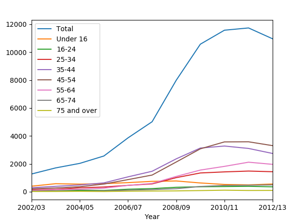
We can observe from the graph, that Total column is huge and overrides everything. We should get rid of it in order to make the graph clearer:
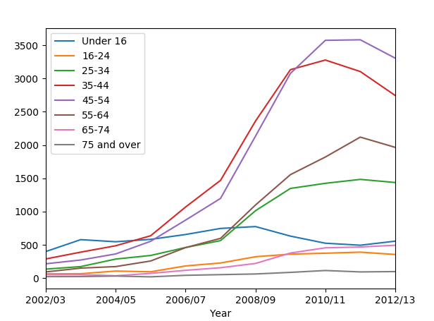
# Drop the total column and plot
data2_minus_total = data2.drop('Total', axis = 1)
We used drop() function. It drops entries from a table.
Now we plot the graph, dropping the Total column:
data2_minus_total.plot()
plt.show()
We get:
What if we want to compare age groups? How do children compare to adults?
In pandas, we can review any column by using data[column_name]. We can plot any age group this way:
data2['Under 16'].plot()
data2['25-34'].plot()
plt.show()
We get:
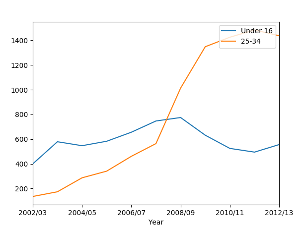
If the legend is missing for you, you can make it visible again by adding:
plt.legend()
We see that while children’s obesity has gone down, that for adults has jumped.
Congratulations, you have learnt how to use the Pandas library in Python programming.